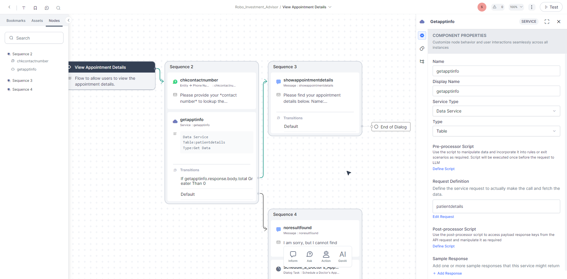
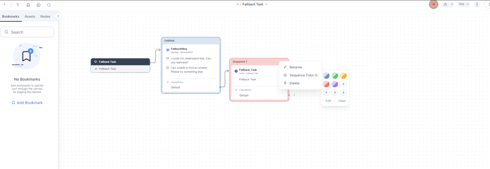
The latest XO UI is very bright and has very less visual and color separation.
I suggest applying good color balance and provide less luminous brightness to reduce too much brightness and whiteness.
It will be wonderful if we have DARK mode (again with proper color balance and separation)
Hello Sohel,
Thank you for reaching out to Kore.ai Community.
Appreciate you sharing the feedback about the UI.
May i request you to share the reference screenshots where you have observed Too Bright and less contrast between elements ?
That would be helpful for the team to validate and update you accordingly.
Thank you,
Srujan Madderla
Kore.ai Community Team