Make your conversations more intuitive by using charts and widgets as part of your bot responses. Kore.ai’s Web and Mobile SDKs provide out-of-the-box support for a wide range of templates to present bot responses as graphs and widgets.
The Bot Builder also provides a nifty feature to start designing your templates. Go to any node where you would like to present a response to user, select Web/Mobile SDK as channel, proceed to Advanced mode. You would see a dropdown with list of all supported templates. Pick one that suits your needs, revise the script to customize your response and you are all set. You may refer below for some general guidelines on how to choose a template.
-
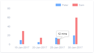
Bar - Use this when you have to compare and show trend over time. Try not to add too many elements as it can get cluttered quickly. E.g. compare leads vs conversations by quarter
-
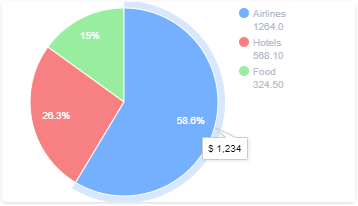
Pie - Most usable to show percentage or proportional data. E.g. expenses per category, status summary of defects etc.
-
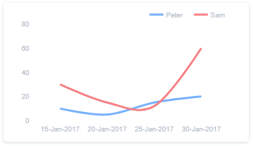
Line - Go for this when you have series of data over a time period
-
Table - Most appropriate when you have multiple rows of data to be presented. You may go for a responsive view of only few columns are important. Consider using mini table to show each row as a card. E.g. sales by quarter, defects across various features etc.,
Refer Message Templates for full specifications.


